Last week I wrote about how you can use the Discrete Attributes Map to ensure that group values with specific names are represented in the graph with specific colors or other visual attributes such as marker symbol or line pattern.
This attributes map also supports a special keyword "OTHER" which can be used to set the visual attributes for all other values that may be encountered in the data. This is a very useful feature that can be used to highlight just the groups of interest in a large crowd.
In this example below, I have simulated a set of data for a large number of molecules, called "Drug-1" to 'Drug-100", along with three popular fictitious drug names "Astrin", "Typenol" and "Mostrin". We want to see the response for these three, in relation to all the others. We don't care about the names of the other molecules. Here is the graph.
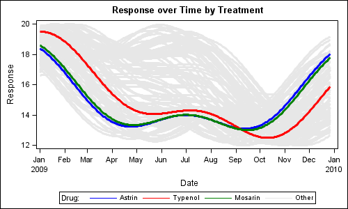
In this graph we have used GTL to define a discretre attributes map to assign specific visual characteristics to the three named drugs. We have also defined a value OTHER that is used for all other names.
GTL Code Fragment:
discreteattrmap name='AttrMap'; value 'Astrin' / lineattrs=(color=blue pattern=solid); value 'Typenol' / lineattrs=(color=red pattern=solid); value 'Mosarin' / lineattrs=(color=green pattern=solid); value OTHER / lineattrs=(color=cxe7e7e7 pattern=solid); enddiscreteattrmap; |
We have also populated the discrete legend directly from the discrete attributes map, so all defined values are displayed.
This exercise also exposed a few holes to us, which we will address in future releases. Note, the legend has 1 pixel lines for the curves, even thought each series has higher line thickness. This is because the values come from the attributes map, not from the series plot. We'll have to address that (somehow). Also, it would be nice if the VALUE statement accepted transparency. Then, the OTHER curves can be made transparent, while the curves of interest can be kept fully opaque, thus avoiding the need to draw them last (see tip below).
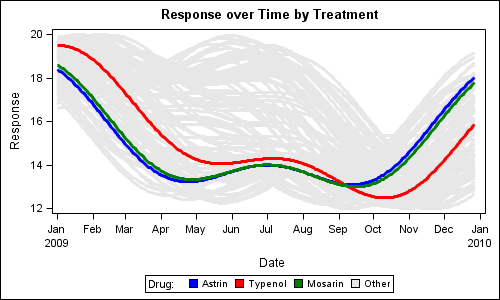
Since the key is based on color, one way around is to use a fill color legend instead of a line color legend. We can add FILLATTRS bundle to each VALUE statement, then use a DISCRETELEGEND with TYPE=FILL, as shown in the graph below.
Tip: You can do this trick when using the attributes map in the legend. You cannot do this if the legend refers to the series plot.
Tip: Be sure that the values of interest are drawn last, so the curves are rendered on top of the grey cloud.
Full SAS 9.3 GTL Code: DiscreteAttrMap


1 Comment
Pingback: Attributes Map – 3 Range Attribute Map - Graphically Speaking